New Faces for new faces
Nju: Faces has been placing models, actors and extras since 2015 — for advertising, catalogue, fashion, film and television. An agency that lives off appearance needs one of its own. We developed it, from the signet to the last printed sheet.
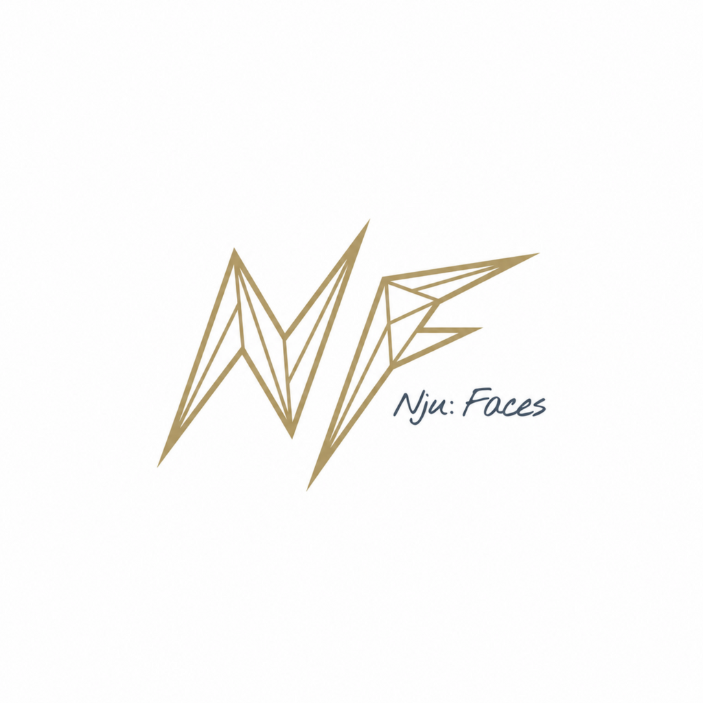

The logo. Three words set the direction: gold, refined, plain. What was wanted was a mark that does not rest but moves forward. Out of the initials came a signet that stands on its own and is recognised at a glance. The golden finish carries the refinement directly, without tipping into the pompous. And timeless here means above all this: nothing can be taken away without being missed.
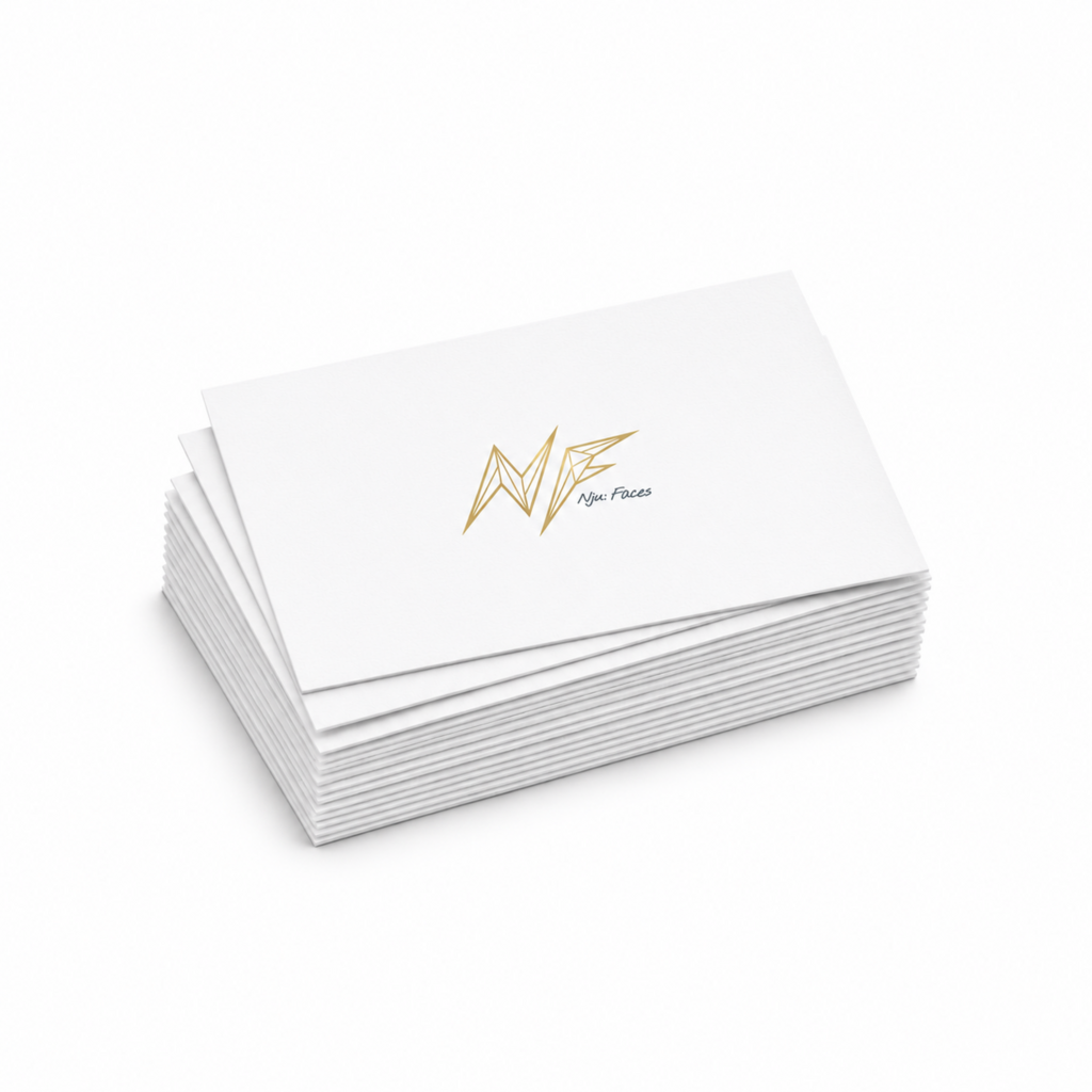
The application. From the signet came an appearance: business cards, letterheads, casting flyers, a folder, poster, roll-up, file spines, signage, T-shirts. Every piece follows the same rule — plenty of white space, one accent colour, no decoration. For film and social media the signet was animated as well. More under Brand Design.
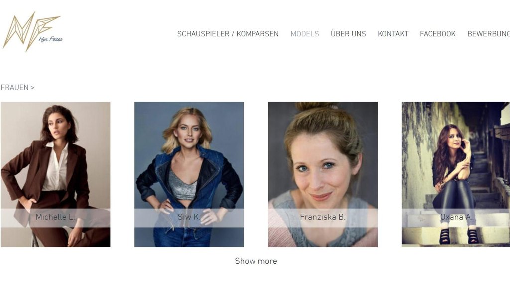
The website. The digital presence closes the circle: a website whose index you leaf through like a stack of setcards, and behind it the same restraint as in print. The faces come first, the brand holds back — and is still recognisable on every page.